
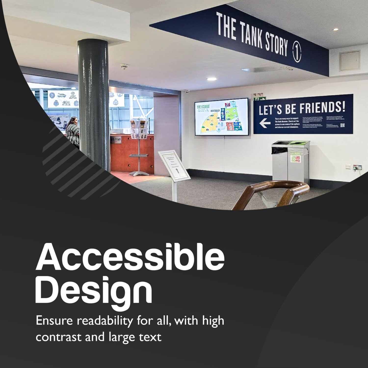
Truly effective signage is inclusive signage.
Accessible design ensures that everyone — regardless of ability — can understand and navigate your space safely and confidently.
Key factors to consider:
 Visual Accessibility (Low Vision & Colour Blindness)
Use high-contrast colour combinations, clear fonts, and strong size scaling. Avoid relying on colour alone to communicate information, as this can exclude colour-blind users.
 Tactile & Braille Support (Visually Impaired)
Raised lettering and Braille allow users with limited or no vision to independently identify rooms, directions, and essential information.
 Placement & Consistency
Signs should be positioned at a readable height and in logical, predictable locations. Consistency in style and positioning across a building helps reduce confusion and improves navigation.
 Cognitive Accessibility (Dementia & Learning Disabilities)
Simple language, clear icons, and uncluttered layouts make information easier to process. Visual cues and symbols can be especially helpful in wayfinding.
Accessible design isn’t just considerate — it’s essential.
It creates inclusive spaces and reflects a thoughtful, professional brand.
